01 Faces Before Logos
The Brand is Human. In a world of polished campaigns, a human face is our strongest signal. Trust at DOUGLAS is built through people. Our logo stands for the brand, our people make it real. We lead with the faces behind the experience because they are the core of our identity. Beauty isn't a factory setting; it’s created by hands, expertise, and heart.
02 Closeness Over Distance
The Lens Moves In. Direct gazes. Hands in action. Real proximity. We capture energy in motion and that quiet, unfiltered pride after a job well done. Togetherness isn’t staged. It shows in how people work, support and rely on each other. Character over perfection. Presence over poses.
03 Real Over Artificial
Authenticity is Our Premium. No stock imagery. No generic diversity checklists. No over-retouching. We show our real employees in their real environments. Diversity isn’t highlighted. It’s naturally present. We champion individuality without exaggeration. What you see is what working here feels like.
04 Raw Meet Refined
Precise, Not Polished. We don’t smooth things out. We show them as they are — but with intention. Light is used to make things visible, not to hide imperfections. We want to see the texture—the skin, the fabric, the tools, the material. The result feels real, but never random.
05 Energy & Focus
The Rhythm of Craft. Work at DOUGLAS moves between pace and concentration. We show both. Moments of action. Moments of focus. Moments where things come together. We capture both the effort and the outcome. That split second when everything clicks. This is professional pride made visible.
06 The Environment Matters
Active Spaces. Our locations aren’t backdrops; they are part of the story. Whether it’s a store, an office, a studio, or a logistics hub, we show them as living, breathing workplaces. We let global scale and humanity coexist. That tension is exactly what defines us.

This board defines how we see our people. It’s about stripping away the corporate filter to reveal the individual. We don’t just capture a face; we capture a personality in its most honest form.Â
Motif: One person. High-intensity portraits and extreme close-ups. One face. One presence. Direct or slightly off-camera gaze. Texture visible. Expression unfiltered.
Execution: Use of sharp focus and intentional lighting to highlight real textures— skin, freckles, and expressions. Lighting reveals character rather than smoothing it. Nothing is softened into perfection. No artificial perfection. Calm or neutral background. The image feels confident, grounded and self-contained.
Effect: Clear presence. Strong character. To show that individuality carries weight. At DOUGLAS, people are not visual decoration — they are the defining presence of the brand

Belonging is visible. This board focuses on the "click" — the energy that happens when diverse minds collaborate. This board captures the closeness and trust within real teams — not staged collaboration, but lived connection.
Motif: Close proximity. Faces near each other. Subtle gestures. Shared focus. Hands entering the same frame. Backgrounds remain neutral or softly present so that connection stays central.
Execution: Intimate framing. Candid moments. We avoid wide, rigid group shots. The camera feels inside the moment, not positioned at a distance.
Effect: Connection feels visible. Not posed, not exaggerated. You sense trust, familiarity and shared context.

Work is a pulse, not a backdrop. In this board we show the active environments where the work happens—stores, warehouses, tech hubs—as living, breathing workplaces.
Motif: Stores, offices, warehouses, tech spaces. Real workflows in motion. Team huddles on the floor, the rhythmic hum of logistics, the focus of the office. Spaces that feel used, structured and alive.
Execution: Authentic atmosphere. Whether it’s the raw energy of a hub or the structured calm of a studio, the space looks lived-in and active. Never sterile. Never empty. We embrace the natural atmosphere of each location.
Effect: The space feels active, structured and alive. You understand how work happens there. Professionalism is shown in context, not staged in isolation.

The evidence of action. The evidence of work. This board focuses on the details that carry impact — the visible traces of precision and responsibility.
Motif: Macro-shots and extreme detail. Hands in motion. Tools mid-use. Marked-up layouts. Notes. Screens in process. Objects on desks. Surfaces showing activity. A coffee cup next to a stack of proofs. Funky socks under a desk. At times, subtle personal fragments within the workspace — grounding the image in lived reality.
Execution: Very close framing. Cropped details. Controlled contrast. Texture stays visible. We elevate the signs of work into proof of quality.
Effect: Detail is our proof of quality. Craft isn't just about the final aesthetic; it’s about the visible commitment in every role, every space, and every discipline. Professionalism and personality coexist here.
Show real people.
Use real employees in real roles. Faces before logos. Character before perfection.
Get close — but stay natural.
Direct gazes when they feel powerful. Looking away when it feels honest.
Not every image needs eye contact. Presence matters more than performance.
Allow looseness.
Moments don’t have to be perfectly composed. Feet on the table. Laughter mid-sentence. Slight movement blur. Confidence can be relaxed.
Capture real interaction.
Leaning in. Side glances. Shared focus. Hands in motion. Belonging shows in proximity, not in posed symmetry.
Keep environments alive.
Spaces should feel used and active. Real desks. Real counters. Real workflows.
Highlight texture and detail.
Skin, tools, materials, scribbles, products in use. Premium means intentional — not sterile.
Let personality show.
Individual style, posture, energy. Beauty includes individuality — not uniformity.
Balance raw and refined.
Documentary honesty with editorial precision. Immediate but considered.
No stock photography.
No interchangeable smiling teams.
No corporate stiffness.
Avoid symmetrical line-ups and staged group poses.
No over-retouching.
No artificial perfection. No plastic gloss.
No sterile spaces.
Avoid empty, showroom-like environments.
No performative diversity.
Representation should feel lived, not curated for optics.
The DOUGLAS People Brand builds on the existing DOUGLAS Group Design System.
We follow the corporate design guidelines wherever applicable. Only where the People Brand requires a distinct expression do we define deliberate adjustments.
Our design is not decorative. It creates the stage on which real people become visible.

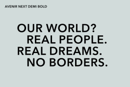
More Statement, Less Subtlety
We use the DOUGLAS Group typeface Avenir Next. However, within the People Brand, typography appears bolder and more editorial.
What differs from the Group system:
Headlines are set in Demi bold.
Large statements are written in uppercase for impact.
Typography may use intentional offset to create tension and energy.
We avoid overly thin or delicate headline styling in employer-facing formats.
This gives the People Brand a more confident, magazine-like presence while staying within the approved type system.

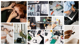
Imagery carries more weight than in classic corporate communication.
We use very large image formats.
Visuals often dominate the layout.
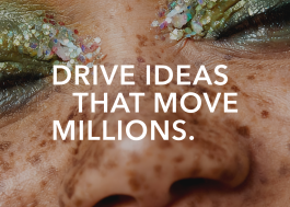
Cropping is tight and intentional.
Faces and details are allowed to take space.
The image is not supporting the headline.
The headline supports the image.

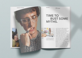
Generous and Intentional
Spacing is wider than in traditional corporate layouts.
More breathing room.
Clear modular logic.
Strong separation between elements.
This creates calm around raw imagery and reinforces premium perception.
Â
Framing & Layout:
Layouts allow for editorial asymmetry.
Cropping may break traditional safety zones (where compliant).
The system provides structure — the People Brand adds attitude.
#fbf9f4
rgb(251, 249, 244)
#d0dbd9
rgb(208, 219, 217)
#2f2f2f
rgb(47, 47, 47)
#ffffff
rgb(255, 255, 255)
#f4eee6
rgb(244, 238, 230)
Adjustments within the People Brand:
Pure white as background color is avoided.
"Sand light" replaces pure white as a background color to give warmth to the people centric design.
The "Powder" tone is only used in context with our stores to maintain visual strength and boldness.
Color is applied intentionally, not decoratively.
Â
The DOUGLAS People Brand does not reinvent the corporate design. It intensifies it.
Got questions or need support?
Reach out to the Group Employer Branding Team: ebteam@douglas.de